Power BI is Microsoft’s data visualization and business analytics tool. Power BI Interface are the user interface features available for users to create and visualize reports, perform data analysis, share insights and make data-driven decisions. Understanding the Power BI interface helps to use its features effectively. Power BI Interface involves several main components:
- Power BI Desktop – This is a Windows application to design and create reports.
- Power BI Service – This is a cloud-based platform to publish, share, and collaborate on reports and dashboards.
- Power BI Mobile – This is Mobile application for viewing and interacting with reports.
Power BI Desktop Interface
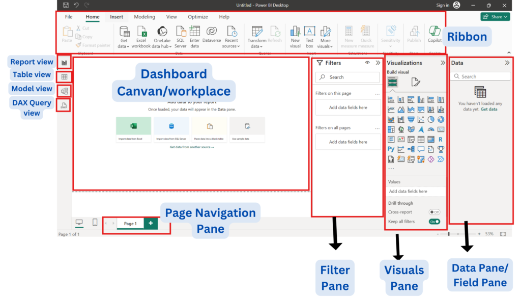
This introduction to Power BI Interface mainly focuses on the features and user interface of Power BI Desktop. Power BI Desktop interface can be broken down into following components:
- Ribbon
- Dashboard Canvas/ workplace
- Filter Pane
- Visuals pane
- Data Pane
- Report view
- Table view
- Model view
- DAX Query view
- Page Navigation Pane
Ribbon
The ribbon in Power BI showcases a set of tools and functionalities for doing most of the activities meant for creating, editing and managing reports & dashboards. This is very similar to ribbons available across Microsoft Office applications. The Power BI ribbon is arranged with tabs and functionality groups that help users go through the options available on the ribbon.
Elements of the Ribbon in Power BI
Tab – different tabs on the ribbon represent different categories of features. Common tabs include:
- Home tab contains basic features on loading data, creating visuals, and managing a report in general. It also includes options for data import, creation of new reports, formatting of visuals, and more.
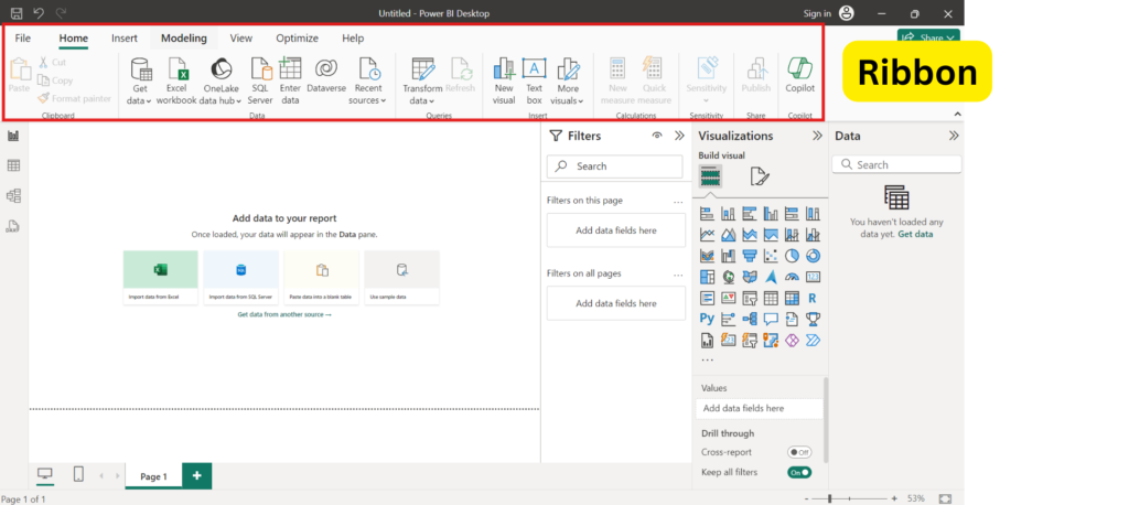
- Model tab deals with management of the data model like data relationships, table properties, and data calculations.
- View tab holds the settings of the report layout and its view. The themes include views such as page view and all the visibility settings towards various elements.
- Insert tab is used to insert new elements into the report, such as charts, visuals, text boxes, images, and buttons, among others.
- Format tab opens upon the selection of a visual. This provide options to edit visual appearance including data colors, borders, titles, and labels.
Groups – Each tab is further organized into groups. For example – Home tab has clipboards for copy/paste operations, inserting different elements, and the addition and management of visuals respectively.
Commands/Buttons – Each tab group contains various commands or buttons that execute specific tasks. These may vary from the standard actions, like saving the report or undo/redo, to more Power BI-specific actions, like creating calculated measures or ways of drilling in data.
Search Box – Search functionality help users to easily locate any particular command or function on the ribbon. This allows easier usage of the interface without scrolling through a number of tabs.
Contextual Ribbon – Certain actions or selections may invoke a contextual ribbon, which exposes other command sets relevant to the selected item. For example, clicking on a specific visual invokes a formatting ribbon where it allows to make further detail customization to that visual.
Dashboard Canvas/Workplace
Workspace is where we stored our Power BI artifacts like reports, semantic models and data-flows. Dashboard Canvas in Power BI gives the flexibility to create visual interface and manage dashboards that will let users organize and interact with the different kinds of data visualization easily.
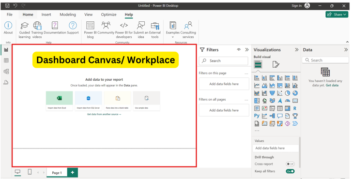
Power BI Dashboard Canvas/Workspace allows for a single view of key metrics and insights, therefore provide users with an effective view of data visualization. It assists in making organizational data-driven decisions more effectively through pinned visuals, interactivity, and collaboration.
Filter Pane
Filter Pane in Power BI is an essential component in the process of making dynamic and insightful reports to meet user specific needs. It will improve analytical capabilities by allowing users to dynamically explore data. It interactively provides a way to engage with the data, enhancing the experience of analysis.
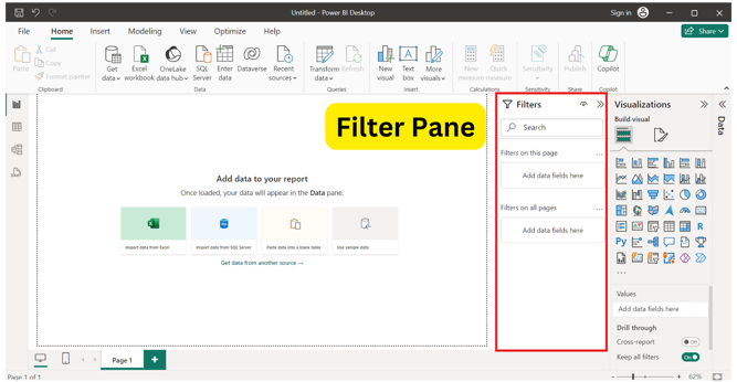
Filters pane contains all filters added to the report by designer and allows business users to interact with those filters and save changes. This does not allow business users to add any new filters to the exiting report. This is the place to see information about the filters, interact with them, save changes or reset to default to go back to original filter settings.
Visuals Pane
Visualizations Pane is one of the many powerful tools within Power BI Desktop to create data visuals. It permits change of complex data sets into easy-to-understand, meaningful and rich visualizations that can be used by decision makers. It can enhance reports, can provide much clearer data insight into a report, that is more effective for the target audience.
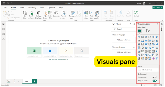
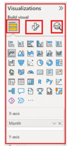
When we edit a report and select a visualization, the Visualizations pane will appear. Use this pane to change visuals on the report. Directly below the Visualizations pane are three icons:
- Stack of bars – Fields icon image
- Paint brush – Format icon image
- Magnifying glass – Analytics icon image
Also note that if we don’t have any visualization selected, filters appear in place of the icons, which lets us apply filters to all visualizations on the page. The best way to learn to use these formatting options is to use them multiple times. We can always undo or go back to default.
Data Pane/Field Pane
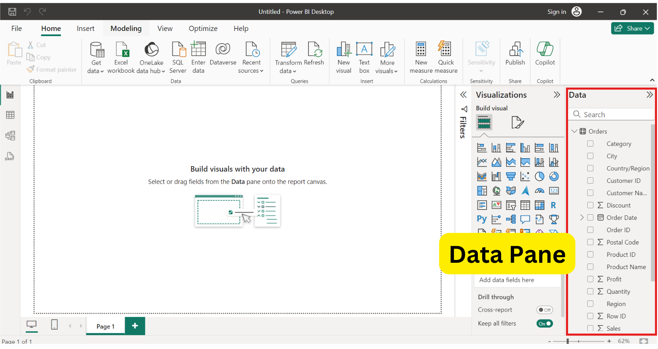
Data/Field pane contains all available tables, folders, and fields in data-set that can be used to create new visualizations.
We can drag a field directly onto the page to start a new visualization. We also have the ability to drag and add new field onto an existing visualization.
Report View
Report view is used to create visualizations using different data sources in Power BI.
We can create charts, graphs, and tables that will give us a meaningful presentation of data. We can also set filters and slicers to interact with the data.
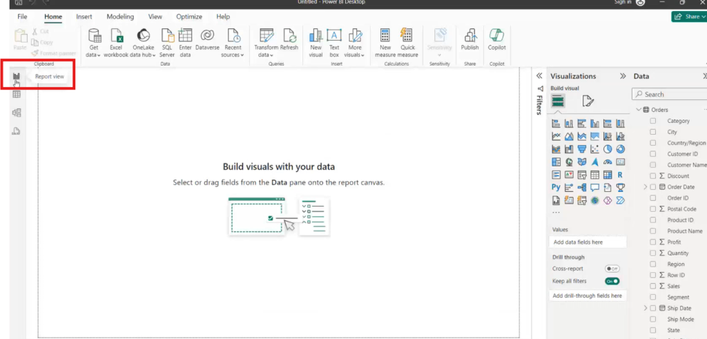
- Canvas – The large, central area where we can place and arrange visualizations (charts, graphs, etc.) to build our report.
- Pages – Tabs at the bottom of the report canvas represent different pages within our report. We can create multiple pages to organize data visualizations.
Table View
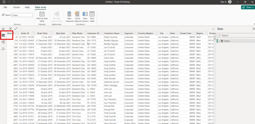
Table view presents data in a tabular format, structured in Power BI. It enables one to view raw data that can be used in creating visualizations within the report view. We can also edit the data directly in the table view.
Model View
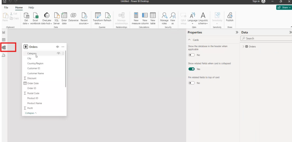
Model view is where interrelationships between different tables in data model are viewed and managed. Through this view, we can easily relate the tables, add calculated columns, and even define measures. It helps us to easily understand our data structure and to shape of our data model for enhanced analytics and visualization.
DAX (Data Analysis Expressions) Query View
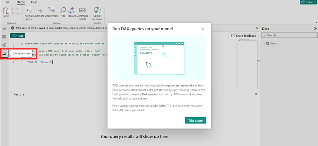
DAX (Data Analysis Expressions) is an equation language used within Power BI to perform custom calculations and aggregations on data. It helps in making of complicated calculations that cannot be formed from the numerous built-in functions that exists in Power BI. In Power BI, these DAX formulas can be used in measures, calculated columns, and calculated tables.
Page Navigation Pane
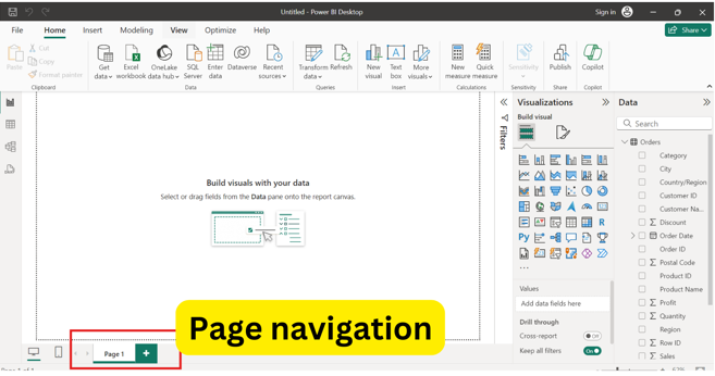
At the bottom of the Power BI desktop, we can see the page navigation. This allows us to add, rename, delete the pages.
We can create different pages as per our requirement and for different visuals, dashboards or reports.
Summary
In this article we learned about different features of Power BI Interface. Following sections were explored:
