Data Visualization
Visualization is the process of creating images, diagrams, or animations involving the representation of information, data or concepts. Visualization are important to communicate a message, represent ideas, or illustrate abstract data and concepts via visuals. Visualization enable individuals to make sense of complex data and find patterns, trends, and insights from the raw data.
Data visualization is the graphical representation of data and information. Data visualization uses visual elements like charts, graphs, maps, and info-graphics to help people understand patterns, trends, and insights in data. The goal of data visualization is to easily understand the data and make complex data more accessible, understandable. Data visualization is more important while dealing with large datasets, complex models and relationships.
Data visualization is one of the key steps in the chain of data science. Once data has been collected, refined, and modeled, it can be presented into visual formats to make meaningful conclusions based on the given information. This process is very important for the data presentation, efficient identification, location, manipulation, formatting, and delivery of data.
Why is data visualization important?
Data visualization uses visuals to make it easier for organizations to make decisions and act based on insights derived from them. Here are some of the reasons because of which data visualization is important.
- Easy to Understand – Data presented in visual formats is much easier to understand. Presenting complex data into easy-to-understand formats.
- Quick Insights – Data visualization helps to gain quick insight. It helps to find patterns, trends, and correlations from the data and helps to make quicker decisions.
- Improved Communication – With the use of data visualization, we can communicate with non-technical persons as well. Persons with no experience in data science can easily understand the data via visuals.
- Engagement – Visualizations tend to attract attention and engage an audience more than raw data or spreadsheets.
- Data Storytelling – Visualizations encourages the storytelling aspect of data since it helps to show the impact and context of that data.
- Error Detection – Visual analysis of data bring out inconsistencies or anomalies that may have been missed while reading through texts.
- Comparative Analysis – Data visuals enables the comparison of diverse data sets or variables, side by side.
- Informed Decisions – The stakeholders would better make data-driven decisions with evidence of relevant information.
- Accessibility – Presenting the data in such a way that it could be accessed by a bigger audience, which may not have technical knowledge.
Data Visualization in Power BI
Power BI is a Data Visualization tool and know for its capabilities to present data in different visual formats. Dashboards created in Power BI are powerful business analytics service, using which we can specify and track key business metrics. Power BI allows users to present data in visuals, create reports and dashboards and share the insights across the organization. Power BI hosts a variety of visualization formats. These visualization formats, based on their complexity and functionality can be categorized into different types.
- Basic Visualizations
- Advanced Visualizations
- Custom Visualizations
- Visual Interaction
- Filters and Other Visuals
Basic Visualizations in Power BI
Power BI provides some basic visual formats like charts, table, matrix, card etc for representation of data.
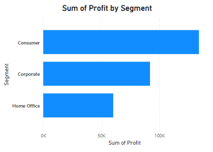
Bar Chart
Bar Chart present information through horizontal bars. Bar chart presents data in a simple manner by arranging and comparing the size of each component to one other. Bar chart can be classified as:
- Clustered Bar Chart – This compares several categories next to each other.
- Stacked Bar Chart – It shows the total amount across categories into sub-categories
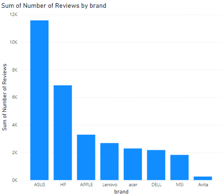
Column Chart
Column chart are similar to bar but charts display information by using vertical bars. It is very good to use when comparing values over time or across categories.
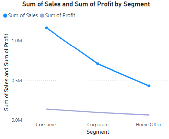
Line Chart
Line Chart visualizations depict the variation of one or more quantities over time through a line connecting a series of data points plotted at regular time intervals. It is used to visualize continuous data, especially time series data and in predictive analytics.
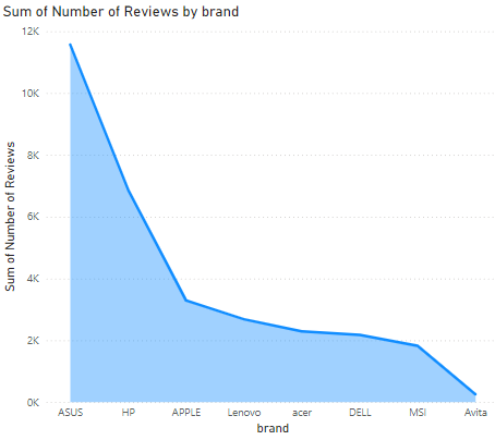
Area Chart
Area Chart is just like line chart with fill the area under the line of a line chart. By filling the area under the line it help to represent the volume of data or cumulative data or trends over time.
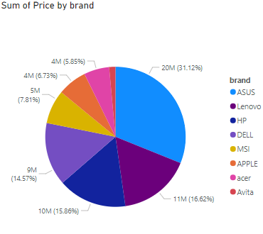
Pie Chart
Plots of this nature have slices of circle that represent parts of a whole. Pie charts are best used when showing percentage distribution among categories.
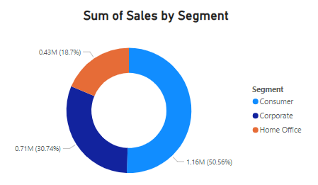
Donut Chart
Donut Chart are very similar to Pie Chart but with a hole in the middle. This allows to show additional information and used for comparisons.
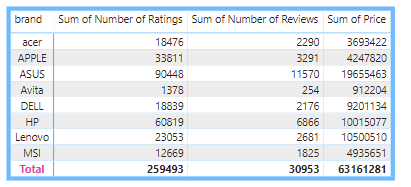
Table
Table type visual include the depiction of rows and columns to compare variables. Table are very good to represent large amount of information in an organized way. These are good to present the detailed information and not good to present only high-level trends.
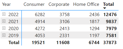
Matrix
Matrix represents table like visualization but can accommodate more complex data structures with categories like hierarchies and pivot of data. It is ideal to show summary data with rows and columns like having subtotals both by row and by column.
Card
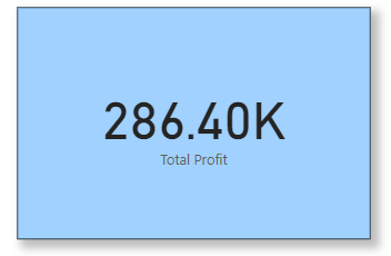
Single card is used to display a single data point (e.g., total sales or profit).
Multi-row card is used to display multiple data points in a card format. This is useful for showing key metrics together.
KPI (Key Performance Indicator)
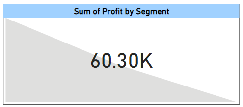
KPI (Key Performance Indicator) is used to show the performance against a target. It help organizations to track and assess their performance against specific goals and also give the quick and clear understanding about the progress towards their objectives.
Map Visuals
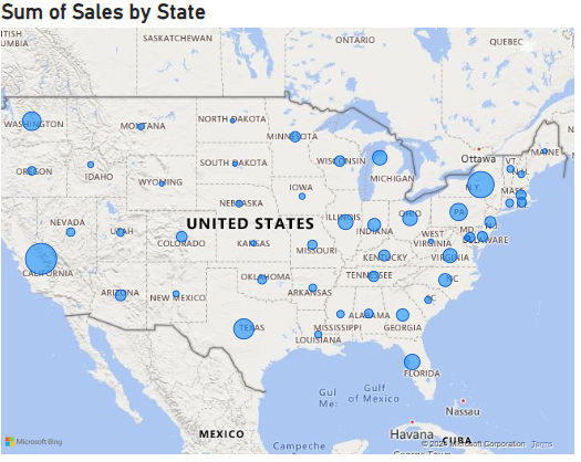
Map visuals help users to visualize geographical data points on a map, which is very helpful for location-based analysis.
- Map for Geographical representations of data points. These are really helpful to show locations, densities.
- Filled Map are similar to maps with color-coded metrics to show regions and areas.
- ArcGIS maps for advanced geospatial data visualization.
Advanced Visualizations in Power BI
Power BI provides advanced visualizations for more advanced representations and interactions.
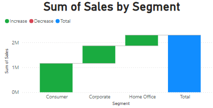
Waterfall Chart
Waterfall charts are very helpful to visualize the cumulative effect of sequentially positive and negative values on a starting point. This helps to see how an initial value is affected by subsequent values.
It is very useful for visualizing how an initial value (such as revenue, profit, or cash flow) is affected by a series of intermediate positive or negative changes.
Funnel Chart
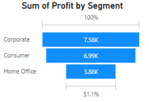
Funnel charts are used to represent data across multiple stages of a process. It is used in sales pipelines or processes where each stage narrows down the number of items.
Scatter Chart
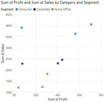
Scatter chart shows the relationship between two measures by points on a Cartesian plane.
It means the values to be plotted along two axes (x-axis and y-axis) which create a visual to represent the relationship between two variables. They are used often regression data analysis.
Bubble Chart
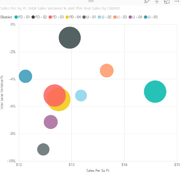
Bubble chart is exactly similar to scatter charts but includes a third variable with x-axis and y-axis, which is represented with the size of a bubble. The size of bubble will vary as per quantitative data in various regions.
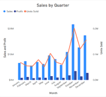
Combo Chart
Combo means combination of two or more things. Combo charts combines multiple charts (like, bars and lines) and represent in a single chart format.
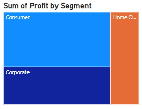
Tree Map
Tree maps are very useful to display hierarchical data with the help of nested rectangles of different sizes and colors as per the different values. Tree maps are good to represent the proportion of parts to the whole.
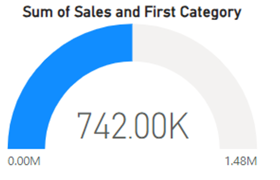
Gauge Chart
Gauge Chart is used to indicate performance against a target. This is normally used for KPIs by showing how far a value is above or below a predefined goal.
Custom Visualizations
Custom visuals means the visuals that can be customized as per the user demand. It can be created by developers and can be imported into Power BI for specialized needs.
- Custom Visuals – These are visuals that may not be available in standard libraries of visualization. With the help of Power BI support, the developers can develop these or source them from Microsoft AppSource. They have unique visualizations according to demands and type of industry.
- R or Python Visuals – These visuals enable users to import visual scripts from R or Python for advanced data science visualizations.
Visual Interaction
These are features that enable visuals to interact with each other and enhances usability:
- Cross-Filtering – It is used to make changes in the one data point visual based on the filtering in another data point.
- Drill through – The user right-clicks on a data point to land on a detailed report page.
- Drilldown – The user moves from data shown at a higher-level summary to data at a lower level, normally arranged logically in some sort of hierarchy.
- Tooltips – It is an elegant way of providing contextual information and detail to data points on a visual.
Filters and Other Visuals
Power BI, apart from the standard visuals, contains elements to filter data and some non-standard visuals, which includes:
- Bookmarks – They are used to captures the current state of a report page for navigation and presentation purposes.
- Slicers – Such visualizations exist in their own right providing to users with filtering functionality on the canvas.
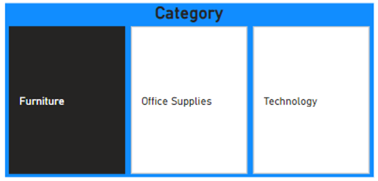
- Selections Pane – It provides users with the capability to toggle (on/off) the visibility of the visuals that sit on the report canvas.
- Data Labels – It provide context; labels added directly to the visuals themselves.
Choosing the right visualization for our data
We can represent our data effectively with the help of dashboards. To make a effective and meaningful dashboard we must be very specific about the selection of right visuals to represent our data. There are some points which we should consider during selection of visuals:
Understand the Type of Data – Each visual is very specific about the type of data.
- Categorical Data – Means qualitative data that can be grouped, such as names or labels.
- Quantitative Data – Means numerical data that can be measured, such as height or price.
- Time-Series Data – When Data points collected or recorded at regular intervals of time.
Purpose of the Visualization – Understand the reason behind to choose any visual.
- Comparison – To be able to show values across different categories or groups.
- Distribution – Showing how the data points spread.
- Composition – Shows how different components make up a whole.
- Time Series Trend – That is meant to show how data change by time.
Selection of Appropriate Chart
- For Categorical Data
- Bar Chart – Useful when you need to compare quantities across several categories.
- Column Chart – Just like a bar chart, only orientated vertically.
- Pie Chart – Useful for showing parts of a whole. Since these are hard to read, so are less used.
- For Quantitative Data
- Histogram – Useful to depict the distribution of numerical data.
- Boxplot – Useful for showing a five-number summary: minimum, first quartile, median, third quartile, maximum
- For Time-Series Data
- Line Chart – Best for showing indication of trends over time.
- Area Chart – Similar to line chart but color-filled between the line and axis in order to highlight volume.
- To Show Relationships
- Scatter Plot – Best for showing relationship between two quantitative variables.
- Bubble Chart – An extension from scatter plots with an additional variable portrayed by the size of bubbles.
- For Composition
- Stacked Bar/Column Chart – Good to show the comparison of the composition of different categories.
- Donut Chart – A variant of pie charts, but with a hole in the middle; good for showing parts of a whole with a clear design.
Know about Your Audience
- Technical vs. Non-Technical – We must know about our audience. Ensure chart type is appropriate for data literacy of audience. Match level of difficulty with the expertise of the target audience; for general use, make it as simple as possible.
Volume of Data – Should known about the volume of data is it large or small. If working on a large dataset, it would be better to summarize it or present summary visuals such as cards or KPIs.
Clarity and Readability – Do not utilize very intricate graphics that confuse the audience. The chart should be legible, understandable, pleasing to the eyes, and clear in the message it is trying to drive across.
Test and Iterate – Whenever possible, test used chart against a sample audience for feedback. Be open to making changes in approach if the feedback provides a compelling reason to adjust your approach.
We can elevate the value of our visualizations in Power BI and ensure better insights lead to decisions.
Summary
In this article, we learned about Data Visuals available in Power BI. Following topics were discussed:

I am really impressed together with your writing abilities and also with the structure on your blog. Is this a paid subject or did you modify it yourself? Either way stay up the excellent quality writing, it is uncommon to look a great weblog like this one these days!