
1. Power BI – Conditional Formatting
Power BI provide a standard conditional formatting which make very easy to change the background or text color of cells in a table or matrix. You can also add data bars-fill the cell with a bar that is proportional in length to the value it represents-and icons such as arrows or shapes, based on the values in the cells of a table or matrix.
It help to evaluate each data point against the conditions that are applied and automatically applies the formatting styles every time the underlying data changes.
How to apply conditional formatting in visuals
To apply conditional formatting on visual you need to follow these steps:
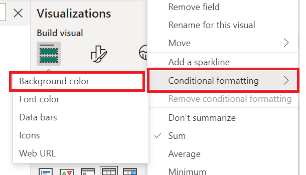
- Select the visual you want to apply conditional formatting(e.g., tables or matrices). Than In the Visualizations pane, Right-click or select the down arrow next to the field in the Values well that you want to format.
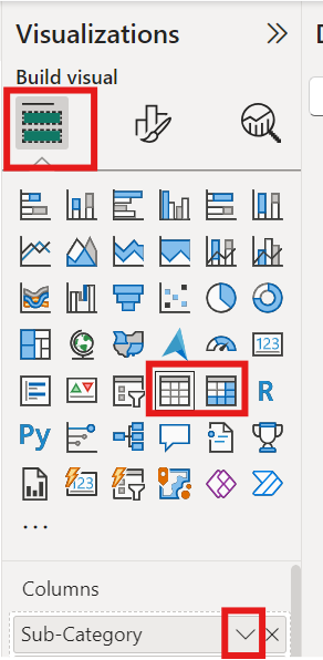
2. After click on down arrow, find the “Conditional formatting” section, click on the formatting field that you want to apply (such as Background color, Font color).
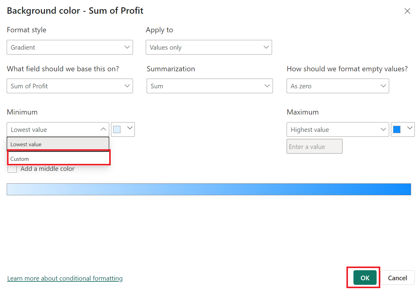
3.For example if you choose the background colour for specific value (column) then you can choose the colour according to your desire and can arrange it in order which you want and just click on ‘OK’.
Note: Under Minimum and Maximum, choose whether to apply the color scheme based on the lowest and highest field values, or on custom values you enter.
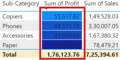
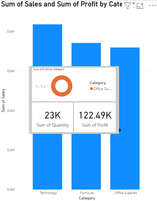
4. Result will be appear like this.
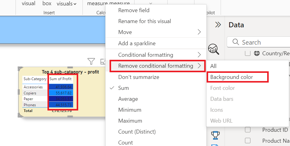
5. Remove Conditional Formatting – To remove conditional formatting on specific column or value, you just simply need to select the value in the visualization pane; then click on the down arrow and find the option to “Remove Conditional Formatting” and click it. Your conditional formatting will be removed.
With the help of conditional formatting you can apply font colors or background colors on values or columns to represent or segregate the into different categories like colour by values(minimum to maximum ), by rules, by percentage (lowest to highest) and based on calculation etc. Not only that you also represent them with data bars.
Data bars in conditional formatting
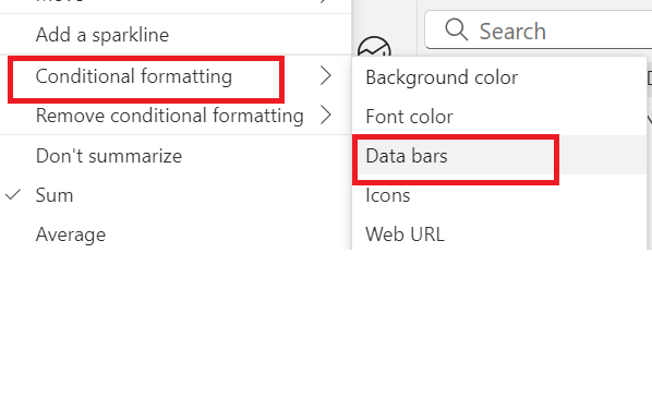
Data bars are used to show a horizontal bar within a cell based on its value. To show data bars based on cell values, select Conditional formatting for the Affordability field, and then select Data bars from the drop-down menu.
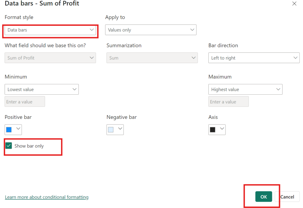
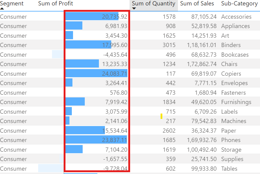
In the Data bars dialog box the “Show bar only” check box is not selected by default so table cells show both the bars and actual values. To display only data bars, select the check box, Show bar only.
You can also give Minimum and Maximum values, data bar colors and direction, axis color.
You can set these up in the same Conditional Formatting section where you define rules based on your data logic.
2. Power BI – Tooltips and Report page Tooltip
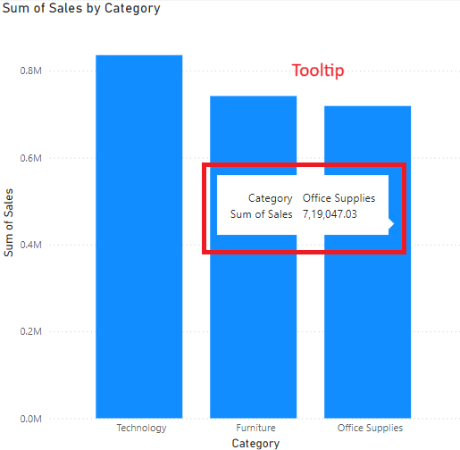
In Power BI, using tooltip is a very elegant way to deliver information that appears on the screen when using the mouse cursor over a visual element placed on the report. Adding tooltips in Power BI can make it easier for the users to understand your visualization by adding more context on it. In power BI, you can tooltips on as many visuals you want.
There are some steps we need to follow to understand how to create customize and report page tooltips and how we can apply on required visuals.
1. Create Customize Tooltip
Step 1: To create customize tooltip first open your report on power BI desktop in which you want to customize tooltips.
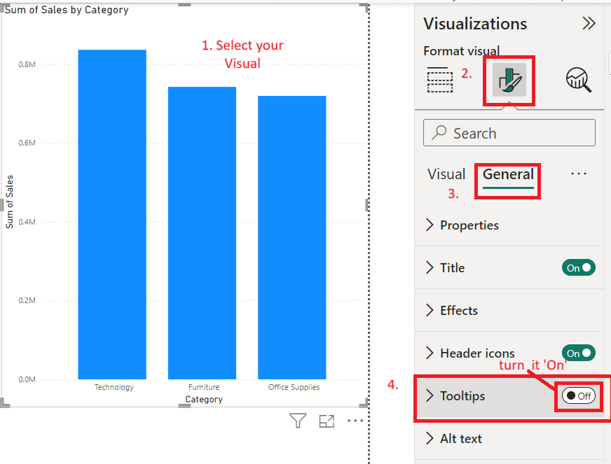
Step 2: Click on the visual to want tooltip on it, go to visualization pane , then click on format your visual and click on General tab, now find the tooltip and turn on to see the tooltip on your desire visual.
Step 3: You can format your the tooltip like change background color , font colour, size etc. as per your demand.
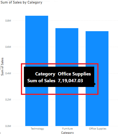
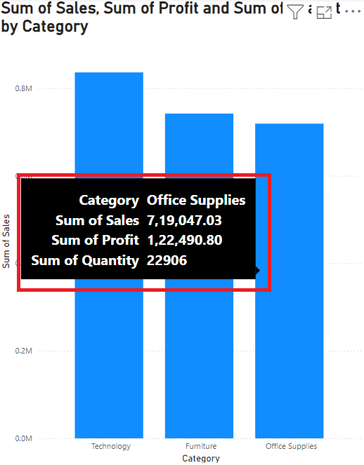
Step 4: Now you will see the tooltip on your selected as depicted in below image.
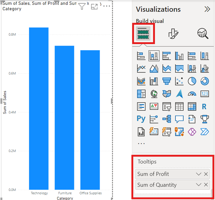
5. Step 5: Now, to make it more customize, if you want to show more information on your tooltip. So you can go to visualization pane, select the build visual and scroll down to find tooltip and drag a field into the Tooltips bucket, shown in the following image. In the following image, two fields have been placed into the Tooltips bucket.
Now you will see the final final look of your tooltip after dragging of two more fields in tooltip bucket. By following these steps you can easily customize your tooltip to make your visual more informative.
2. Create Report page Tooltip
Report page tooltip give a rich, interactive view to the visual, When you hover the mouse over data points in visuals. There are some steps need to follow to create the report page tooltip on required visual.
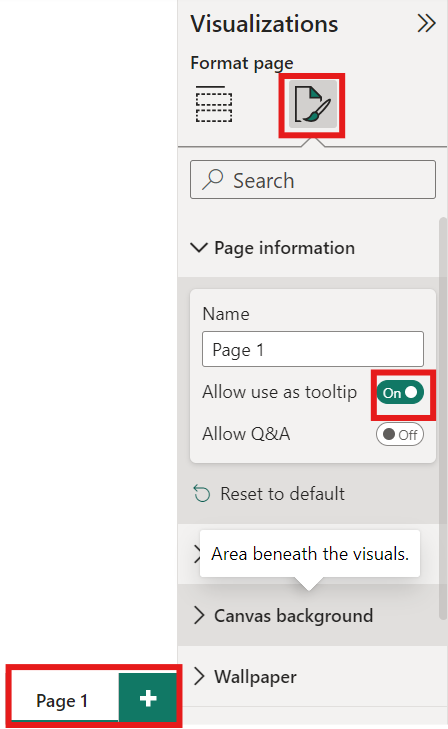
1. First open the new page
2. Go to visualization panel, select format page, go to page information and drop down and make tool tip on for page.
3. Rename this page to something like “Tooltip Page”
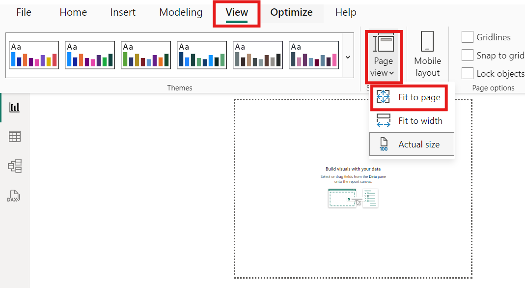
4. Now you will see the standard size of visual on screen, to make it fit to page go to ‘view’ and select ‘page view’ and click on ‘fit to page’.
5. Drag the visuals you would like to display as the tooltip onto this new page. Add filters or slicers to what data is being displayed.
6. Set Up Your Original Visual to use the the Tooltip Page.
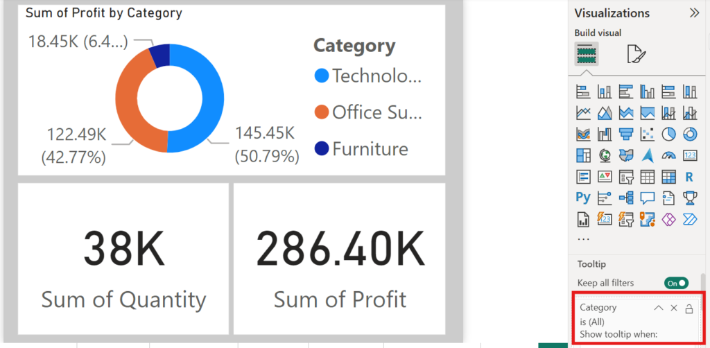
7. Now go back into the original page (Report page) -the one that contains the visual you would like to assign to the tooltip.
8. Mouse over data points of the original visualization to render tooltip on the report page. Ensure that the data to be shown is as expected.
3. Power BI – Adding Images and Branding
Reports can now include additional images, branding, and custom themes to make the reports more attractive and correctly placed in any organizational branding. You can change the look of your entire report, like changing it to corporate colors, a new icon set, or applying new default formatting to visuals, using the Power BI Desktop report themes.
With the aid of custom branding, you can completely change the look and feel of Power BI for your entire organization. Since it cannot be overridden by the use of any other theme, custom branding helps you easily differentiate your organization.
Now goes through, step by step with the instructions provided in the section below on how to customize report themes, add logos and images, and use a custom background in Power BI to create an interactive and unique report:
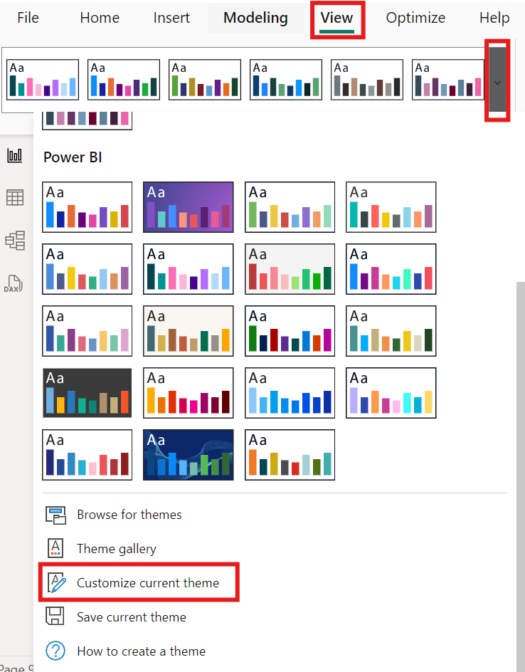
a. Customizing Report Themes
- Open a Report in Power BI Desktop that you would like to customize.
- Click on the “View” tab to get Access Theme Options from the ribbon top of the Power BI Desktop.
- There is number of pre-defined themes are available to apply on your report. But in case these default themes are not able fill your requirements.
- Then you can customize the theme as per your demand, click on the “Customize current theme” button under the “Themes” section
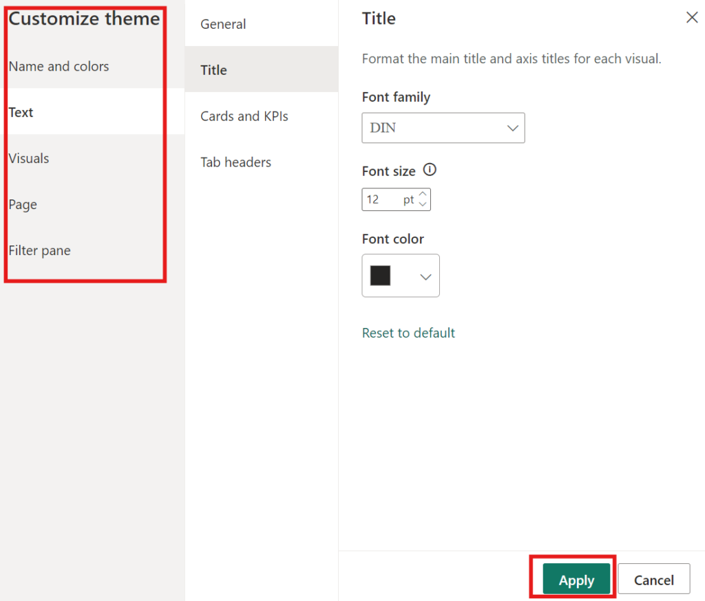
5. In the “Theme Options” pane you can adjust the following elements:
Colors: Identify colors that can be utilized for data visuals, background as well as text.
Font: Set specific fonts for titles, cards KPIs, and bodies.
6. After customize the colour and font as per your demand click on ‘Apply’ to see the effect of customize theme on your report.
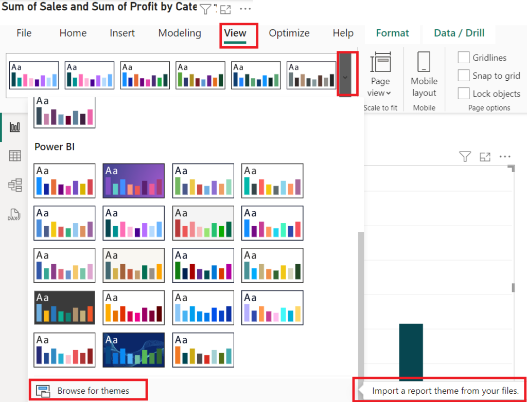
7. JSON File Import for Advanced Customization (Optional):
Note : If you have a specific theme you want, you can import a theme from a JSON file.
For this click the “Browse for Themes” button in the “Themes” section and import your JSON file.
The basic example of JSON Theme:
{
    "name": "Custom Theme",
    "firstLevelElements": "#252423",
    "secondLevelElements": "#605E5C",
    "thirdLevelElements": "#F3F2F1",
    "fourthLevelElements": "#B3B0AD",
    "background": "#FFFFFF",
    "secondaryBackground": "#C8C6C4",
    "tableAccent": "#118DFF"
}
Save the file with a .json extension and import it.
b. Adding Logos and Images to Reports
- To insert image in your report, open the ‘Insert’ tab in the ribbon at the top and select ‘image’.
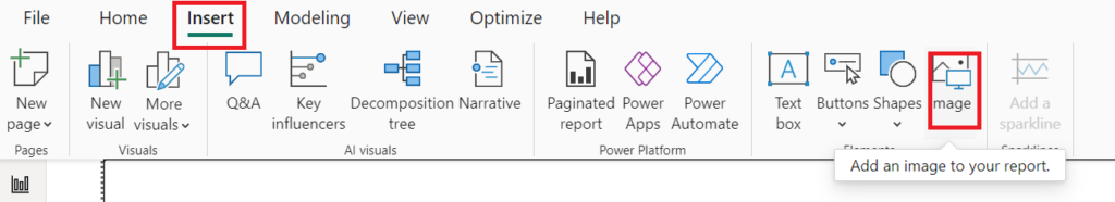
2. Find the path of an image file, such as a logo on your computer, and select it to include it in the document.
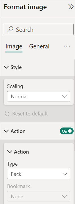
3. To set the size and position of image, simply drag on the corners to resize an image and adjust positioning, alignment and space around it by using “Format Pane”.
3. Using Custom Backgrounds
- To set an image as background, click anywhere in the report area (not on a visual) to ensure that your background settings are selected for the entire page/story.
- Then go to the “Format” pane and dropdown the “Canvas Background”.
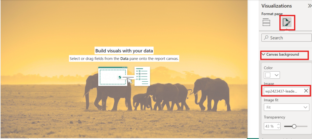
3. In the “Background” settings you can change the background colour or you can download the background image by “Click on Add Image”.
4. Upload a photo file or provide an address of the image.
5. Adjust the Transparency slider so that your background image blends perfectly with your elements of the report.
6. And, Describe Image Fit options, like Fill, Fit, Stretch, etc., which will determine how the image would appear in the report.
By following these easy steps that you will learn how to successfully add images, logos, and customize themes in Power BI so your reports are not just nice looking but also align with your brand.