
The mobile application for Power BI is in short called Power BI Mobile: It gives users access from their tablets and smartphones to reports and dashboards. Power BI Mobile is not only supported on Android and iOS operating systems but also connect you and your devices-macOS ,windows – to your cloud and on-premises data wherever you go.
Mobile apps give you access to most of the functions you have with the Power BI service-for viewing, analysis, and interaction with your data. These functions include cross-highlighting, cross-report drillthrough, and filtering etc.
There are more benefits of Power BI mobile for organizations through that considerably it more user-friendly:
- With the help of Power BI mobile app you can view offline; the data remains accessible, despite some regions being poorly connected.
- You can be reporting that filters based on your current geolocation, hence delivering focused information on the go.
- It provides Barcode scanning capabilities that allow you to quickly access filtered data on-site.
- It has an automatic slideshow feature on reports, launching whenever the app is opened through the Windows app.
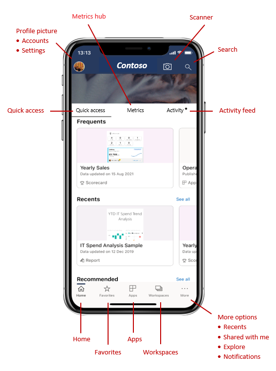
Home page of Power BI Mobile
As soon as you launch the Power BI Mobile app, you are encouraged to log on to your Power BI account. After navigating through a few introductory screens, you’ll be taken directly to the home page, as depicted in the this figure.
The home page of a typical Power BI Mobile app is usually the one from which users can view any reports, dashboards, and datasets they want to.
There are some potential key features you might find on the home page of the Power BI mobile app are describe below:
source: https://learn.microsoft.com/en-us/training/modules/explore-power-bi-mobile-apps/2-find-your-data
The Top Header at the Homepage and the Action Bar at the Bottom contain items to jump to virtually any content or perform many actions very quickly.
- Quick access: If you want to see your content. you can click on quick access for it.
- Search bar: If you want quick search of any report, dashboard, or dataset present within the application use search bar
- Workspace: Workspaces present on the action bar, it has list of workspaces for that you have access to see them . When you click on any of workspace, you get a list of reports and dashboards in that workspace that you can choose from.
- Settings and Profile: Settings and profile present on the top header, these User profile settings, app settings and possibly options are use to control account settings.
- Activity feed: In activity feed, reports and dashboards that have been most recently opened are listed, so the user can easily open frequently used items.
- Favorites, Apps, Recents, or Shared with me: If you click any of these options present on action bar. they will open the corresponding list of dashboards, reports, and apps to choose from.
- Notifications: Present on action bar, give alerts or alerts about refresh of data, comments, or any changes made in shared reports.
- Metrics Hub: Another option is Power BI Mobile’s “Metrics Hub”: this allows easy, streamlined access for users to critical metrics and key performance indicators, letting them interact with them over datasets.
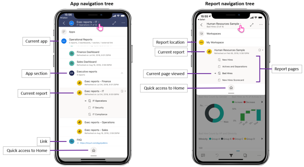
Navigation Tree in Power BI Mobile
The navigation tree in Power BI Mobile is nothing more than an organization of reports and dashboards to be easily accessed from mobile devices by users. Power BI Mobile should make it easier to view reports and dashboards on a smartphone or tablet.
Once you open up a report, dashboard, or application, the navigation tree will be accessible to find and navigate your content quickly. To view the navigation tree, just tap on the header dropdown menu.
The navigation tree allows you to easily view, in one glance, which location in the hierarchy your content lives and will allow you to move up the content hierarchy, navigate to sibling content, and also back to your home page. If the current item you’re viewing is an application, the tree shows everything contained within an application: Sections and links and all the report and dashboards. And if it is a report, you’ll get all the report pages which are visible there also.
Source: https://learn.microsoft.com/en-us/training/modules/explore-power-bi-mobile-apps/2-find-your-data
Here are some steps and tips to help you set up and optimize a navigation tree in Power BI Mobile:
1. Use the Power BI App: Download the Power BI app on your mobile device and Login to your Power BI account to view your reports and dashboards.
2. Organize Content in Workspaces: Use the separate workspaces (Project, Department, or Subject-Based) to categorize reports and dashboards so you can enable members of a working team to share a workspace to keep content centralized.
3. Establish a Report Structure: Structure your reports so they are relevant and helpful for your audience. Consider grouping related kinds of reports or dashboards to make navigation easier.
4. Report Sections: You can create separate pages or tabs in a Power BI report. Each may represent various sections of your analysis. This means that the readers can easily move through the different insights
5. Utilize Bookmarks: Power BI enables you to take a bookmark to record the state of a report page. You can use them to go to other parts of the report quickly. This will allow you to give a view customized for mobile users
6. Mobile-Optimized Views: While developing your reports be sure to make them viewing-friendly on mobiles. This means that your visuals are both readable and touch-friendly.
You can add a mobile layout by “View” -> “Mobile Layout” on Power BI Desktop
7. Navigation Buttons: Allow people to navigate your report pages by adding navigation buttons. Navigation buttons are clickable links that can be used to take the viewers to another page of a report or even to an external URL.
8. Use Tooltips: A tooltip can be used to enhance the context or a navigation selection. This is especially important on mobile platforms.
9. Update Regularly: Your reports as well as dashboards have to be updated such that the users are accessing the most relevant information.
Creating mobile-friendly reports in Power BI
The Power BI reports should be developed to be mobile-friendly, so your data visualization can be accessed and viewed on any handheld mobile device. Here’s how to develop mobile-friendly reports with Power BI.
1. Make a design in mind for Mobile view
Use the Mobile Layout – Power BI enables you to prepare a particular mobile layout for a report. Tap on the “View” tab in Power BI Desktop and then click on “Phone layout” to start designing for mobile devices.
Keep it simple in the visual –The screens are significantly smaller on a mobile device, so you want to be able to show people what’s important. Avoid crowding it. Keep your focus on key metrics.
Use Large Fonts and Buttons – Text should be readable, and buttons should be big enough to easily tap with fingers.
source: https://learn.microsoft.com/en-us/training/modules/explore-power-bi-mobile-apps/3-view-interact-with-your-data
2. Optimize the Report Layout
Vertical Orientation: Mobile devices are predominantly used in vertical (portrait) orientation. Design your reports to fit this layout.
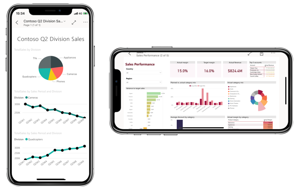
Stack Visuals: Instead of side-by-side visuals, stack them vertically to ensure they fit well on a mobile screen as shown in above picture .
Limit the Number of Visuals: Aim for a clean design by limiting the number of visuals per report page to avoid overwhelming the user.
3. Use Responsive Visuals
Responsive Settings: To make attractive and responsive report use Power BI’s responsive visuals feature, which automatically adjusts the size and layout of visuals based on the screen size.
Avoid Overlapping: Make sure that visuals do not overlap or become distorted when resized for smaller screens.
Source : https://learn.microsoft.com/en-us/power-bi/create-reports/power-bi-create-mobile-optimized-report-format-visuals
4. Interactivity and Navigation
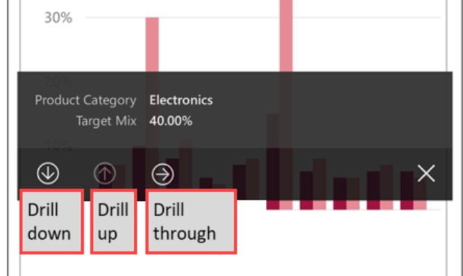
Use Drill-throughs & Tooltips: Allow users to drill down, drill up, and drill through to another report page from a visual and a value but keep the main report page simple. If drill up, drill down, or drill through have been configured on a visual, you can perform these actions by tapping and holding a data point on the visual.
Tooltips can provide additional context without crowding the primary view. You can long tap (tap and hold) a data point to display a tooltip on the point.
Page Navigation: Use buttons for clear navigation between different report pages to make it easy for users to explore the data.
5. Testing on Mobile Devices
Test on Actual Devices: Always test your report on actual mobile devices (both Android and iOS) to understand how users will interact with it.
Use Power BI Mobile App: Publish your report and open it in the Power BI Mobile app to ensure that everything displays correctly.
6. Publishing and Sharing
Publish to Power BI Service: Once your report is ready, publish it to the Power BI service to make it accessible on mobile devices.
Share with Users: Share the report with users, ensuring that permissions are set correctly for everyone who needs access.
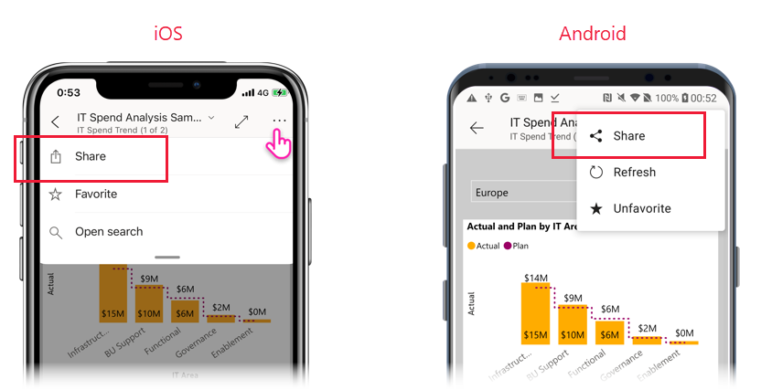
In order to share views, go to the item you want to share, apply the filters or bookmarks you need to obtain the view of the data you want to share, and then click on the Share, which is found in the header under More options (.). If enough space is available in the header, the Share option may already be visible in the header.
7. Ongoing Monitoring and Updates
Gather Feedback: After users have interacted with the report, gather feedback to understand pain points or areas for improvement.
Iterate: Use the feedback to refine the report and make adjustments as needed.