Dashboard in Power BI is a single-page “canvas” that displays visualizations (charts, graphs, tables, etc.) to provide meaningful insights from the given dataset. Dashboards are very helpful to monitor key metrics and track performance of different parameters in real time. Dashboards in Power BI are created by pinning visuals from multiple reports. Dashboards are easy way to aggregate data from various sources into one unified view.
Dashboard visuals in Power BI
When we start working with Power BI, lack of right knowledge about the visuals can lead to a redundant report. To uncover powerful insights, we need to understand when and how to apply ideas so we don’t waste valuable time producing reports that don’t have an impact.
Here, we will learn the basics of using standard Power BI views but also information about sizing views, their role in design, use cases, and examples. Additionally, we build visuals to represent insights in different ways that allows us to efficiently use images and be organized in our dashboards.
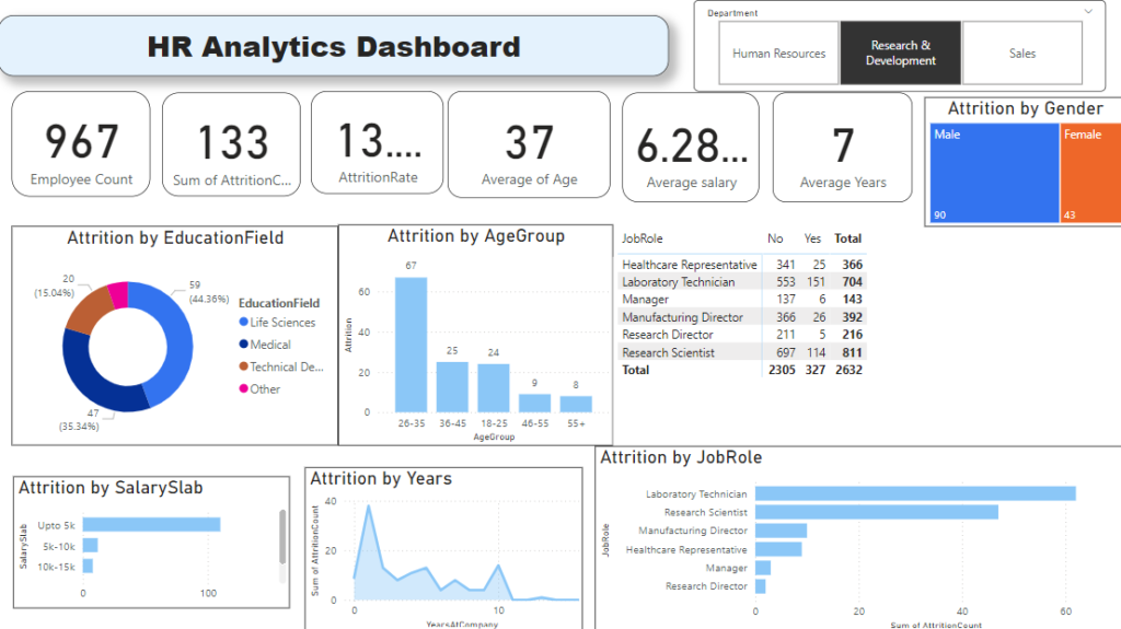
Understand symbols on data imported in Power BI
When you import the data to create dashboard you’ll see that there are numerous types of columns in your data. Some holding numeric values, some representing dates, some containing text values and some containing geographical data as well. To sort out such columns which have different-different types of values there are some symbols present that will indicate their values. They are
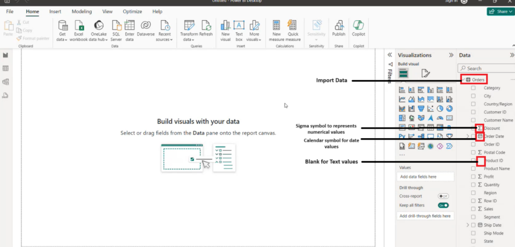
Sigma Symbol – The Sigma symbol is utilized to represent statistical measures such as total, average mean, count of the number of items, and so on and so forth in the data imported into Power BI. This type of calculation is represented through visuals.
Calendar sign – This is normally used to represent dates and times from the dataset that has been imported into Power BI. It could be used to build hierarchies of dates, filters, or slicers in our reports or dashboards.
Text symbol – An empty text symbol in Power BI means any kind of textual information that exists as a part of dataset. This include things such as categories, labels, and descriptions, along with many other types of data which don’t have numbers as an element. Normally, text symbols are used for grouping purposes, filtering of texts, and to make graphs within the report or on dashboard.
How to use visuals in Power BI
Before we start creating visuals in Power BI, we need to import our data into Power BI Desktop.
Import data into Power BI Desktop
- On the Power BI Desktop, click on the “Get Data” button present on the Home tab.
- Then select type of data source we want to import from. Follow the prompts to connect to selected data source.
- Choose the tables or queries we want to import into Power BI Desktop and allow to load data.
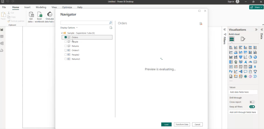
We will see all the imported tables into our data model.
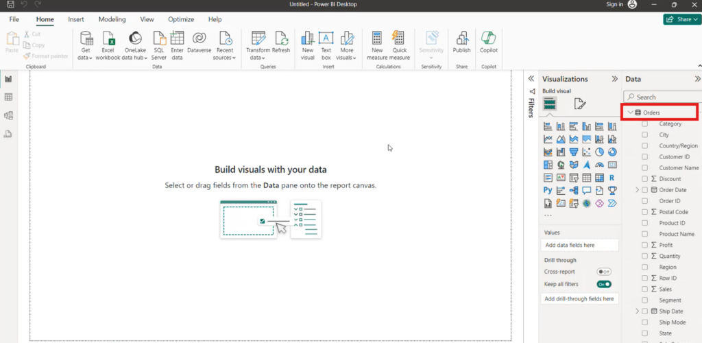
Now, lets see how we can create different visuals in Power BI.
Text Bar – Use Text Bar in Power BI
Use of Text Bar visual in Power BI requires the following steps:
- On Power BI Desktop, select the report or dashboard where we want to add the Text Bar.
- Then move to the top menu, click the “Insert” tab.
- Then, select the “Text box” option from the “Text” section. Click and drag on the canvas to create the text box where we want it to place.
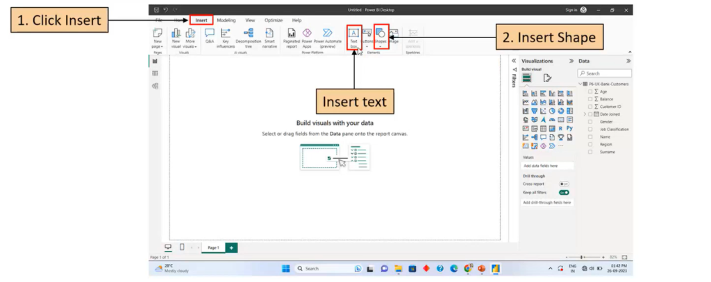
- Type the desired text into the text box. In this example, we have typed “Bar Chart”.
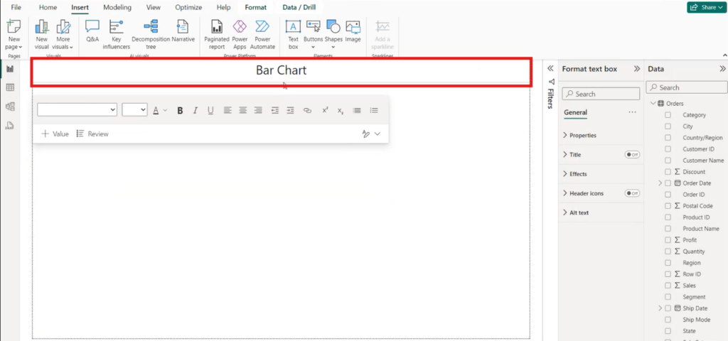
- To customize the font, size, color, alignment, and other properties of the text use the formatting options in the top menu
- To resize or reposition the text box, click and drag on the borders or corners of the box.
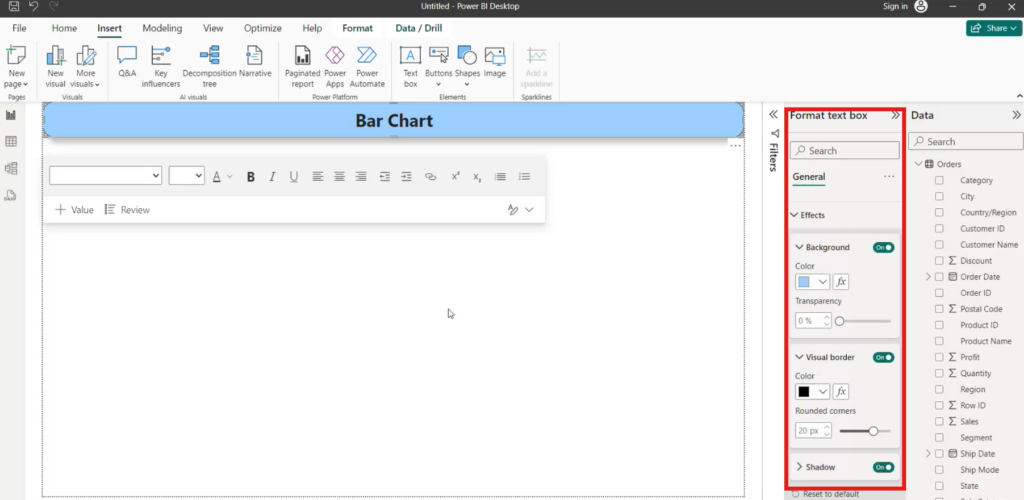
- Format Text Box – Select the text bod to format and use the variety of formatting options within the pane on the right side of the window, and change the appearance of the text box with a different font style, size, color, alignment, etc.
- We can also adjust the border style, color, thickness of the text box and the background color as well.
- Once we are done with formatting, click outside of the box to save the changes.
Bar Chart – Use Bar Chart in Power BI
Use of Bar Chart visual in Power BI requires the following steps:
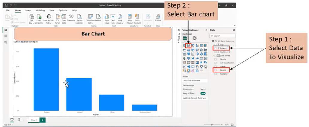
- Bar Chart represents data using the x-y axis. First, we have to select the fields that we want to visualize onto the “Axis” and “Values” sections in the Visualizations pane. e.g. from the Data Section (Field Pane) drag the field “Product condition” (mentioned as condition in image) into the “Axis” and field “Sum of grade” (mentioned as grade in image) as “Values”.
- Then, click on the “Bar Chart” icon present in the Visualizations Pane.
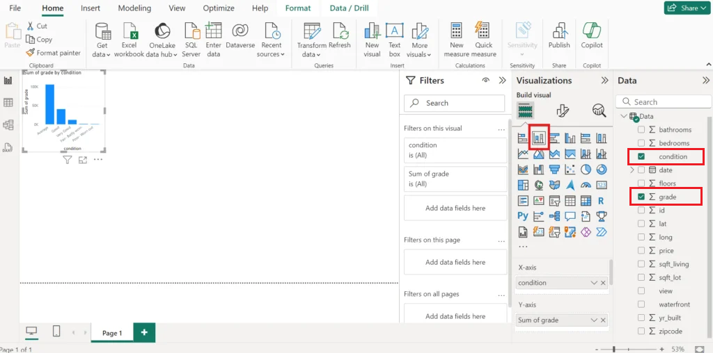
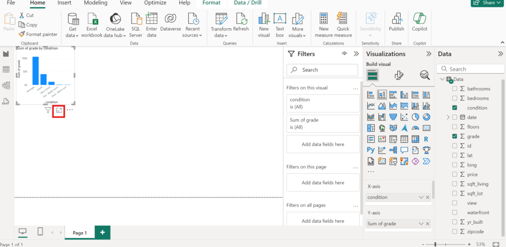
- Click on the focus mode to get the standard size of visual.
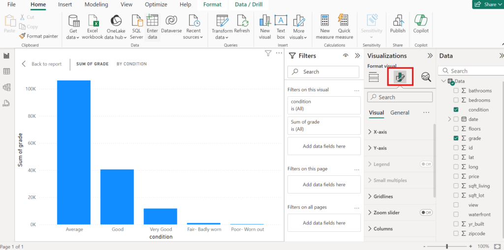
- We can customize our Bar chart by adjusting the formatting options form the Visualizations Pane, like changing the colors, axis titles, and data labels etc.
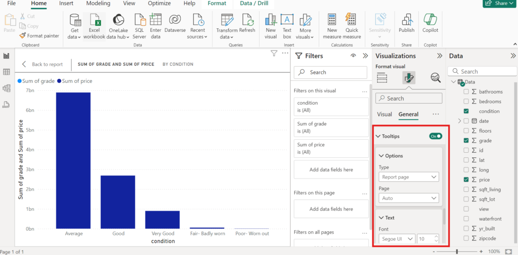
- From the Data Section (Fields Pane), we can add additional fields to the “Legend” or “Tooltip” sections in the Visualizations Pane. Legend and Tooltip are used to show the meaning of value.
Once Bar Chart is complete, we can save our report and publish it to the Power BI service for sharing with others.
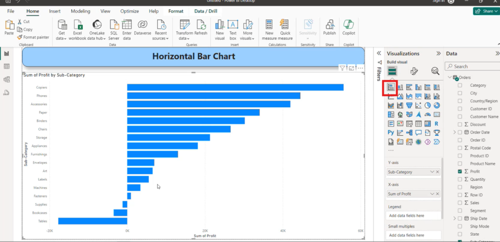
Use Horizontal Bar Chart in Power BI
- Select the Horizontal Bar Chart icon as highlighted in the image.
- To create horizontal bar chart, we have to select the fields that we want to visualize onto the “Axis” and “Values” in the Visualizations pane.
- This is very similar as we did for Bar Chart. Follow the same steps like bar chart after selection of horizontal bar cart icon.
Use Pie Chart in Power BI
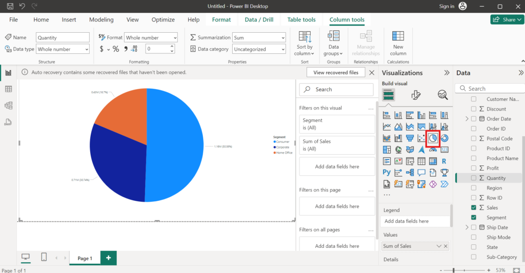
Select the Pie Chart icon as highlighted in the image.
Pie Chart visuals are used to show the breakdown of elements that add up to a whole.
Select the field from the Data Section (Filed Pane), which we want to show it using Pie Chart.
Use Donut Chart in Power BI
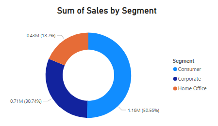
Select the Donut Chart icon as highlighted in the image.
Donut chart is also used to show the breakdown of elements that add up to a whole. This is similar to Pie Chart with a hole in the middle.
Select the field from the Data Section (Filed Pane), which we want to show it using Donut Chart.
Use Map in Power BI
Lets first understand the importance of Map visual in Data Analysis.
Why we create maps in Power BI?
Map visuals in Power BI are used to represent geographical data. It help users to better understand and analyze data based on their geographical locations. Maps can provide valuable insights into trends, data-patterns, and relationships from the data that may not be possible from other types of visuals.
We cannot use Map visuals directly. There are Map settings that we need to configure before using the Map visuals.
How to configure Map setting?
- First upload and import the data in Power BI
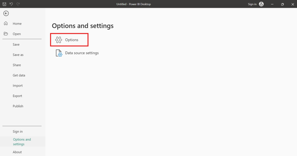
- Click on the Options and settings from the File menu.
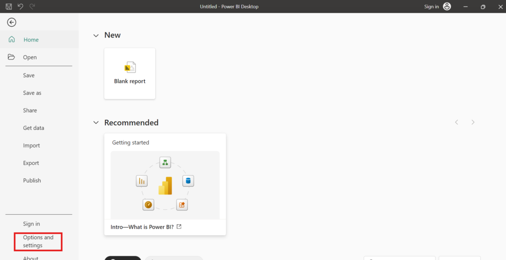
- Then click on the options under the Options and settings.
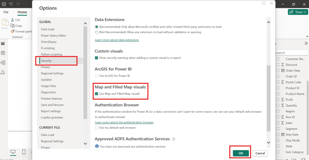
- Go to security, enable the map and filled map visuals and click on OK.
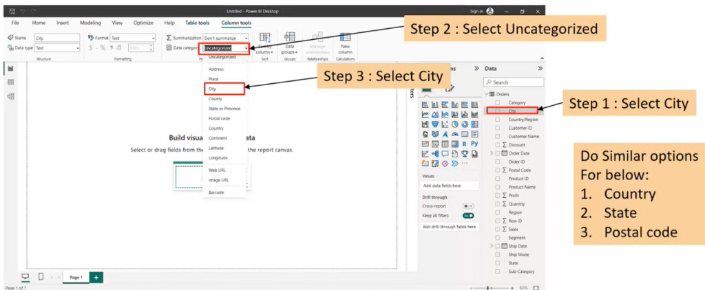
- For Map visuals, we can use only those columns which are categorized as location columns like city, state, postal code or country etc.
- For example, we have a “city” column in our data-set. Select the “city” column from the Data Section (Field Pane), then under the Column tools menu, update the Data category from “uncategorized” to “city” category. We will then see a globe symbol appear in front of the respective column.
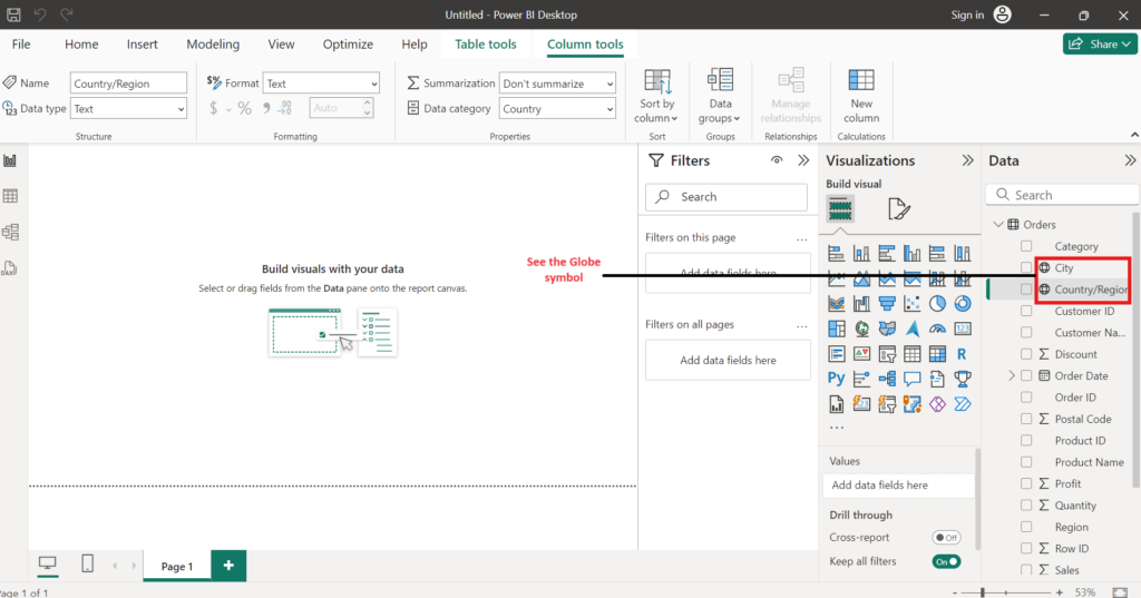
After this Map configurations, we are ready to use different type of Maps like Filled Map, Bubble Map, Heat Map etc.
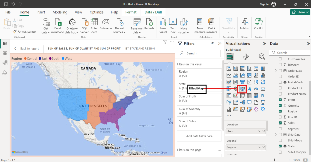
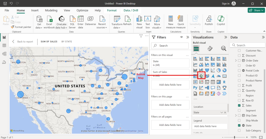
Note: To create a map generally we require to select one location column and one numerical value column.
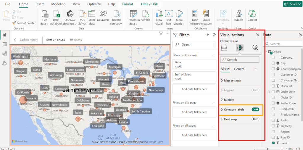
How to Customize Map Visual
To make Map visuals more attractive and informative, we can use visual formatting and ensure the category labels.
Use Card Visual in Power BI
Purpose of using Card visuals in power BI
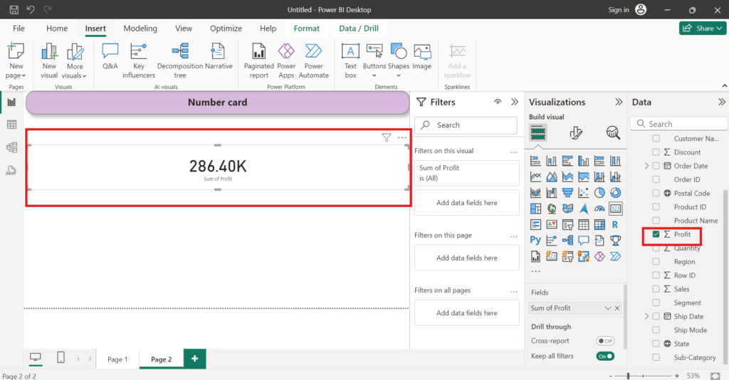
Card visuals are used to provide concise and simple representation of important information on the dashboard or reports. Cards are like small windows that show a specific number or data point. We can used Cards to show sales, profits, or other important numbers at a glance. Cards are easy to read and understand. We can change how card looks to make them useful and interactive.
To create a cards follow these steps:
- Select the Card icon as highlighted in the image.
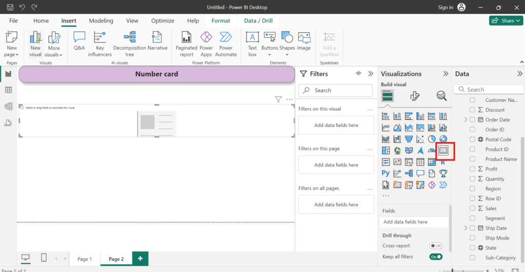
- A blank card visual will appear on the canvas.
- From the Data Section (Fields Pane) on the right side of the screen, drag and drop the measure or field we want to display on the card. e.g we have selected “Profit” measure to show in the Card.
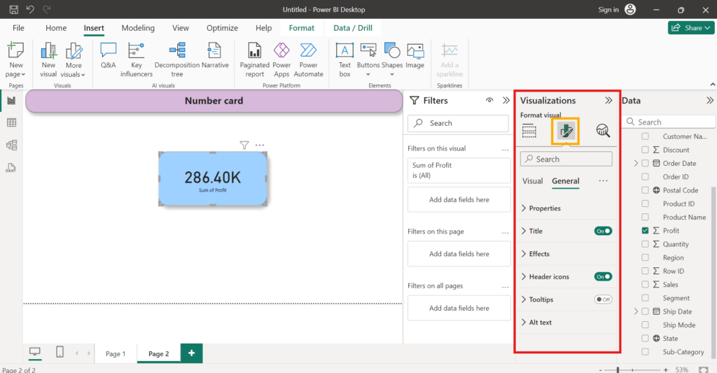
- We can customize the card by changing the font, colour, background, and other formatting options available in the visualizations formatting pane.
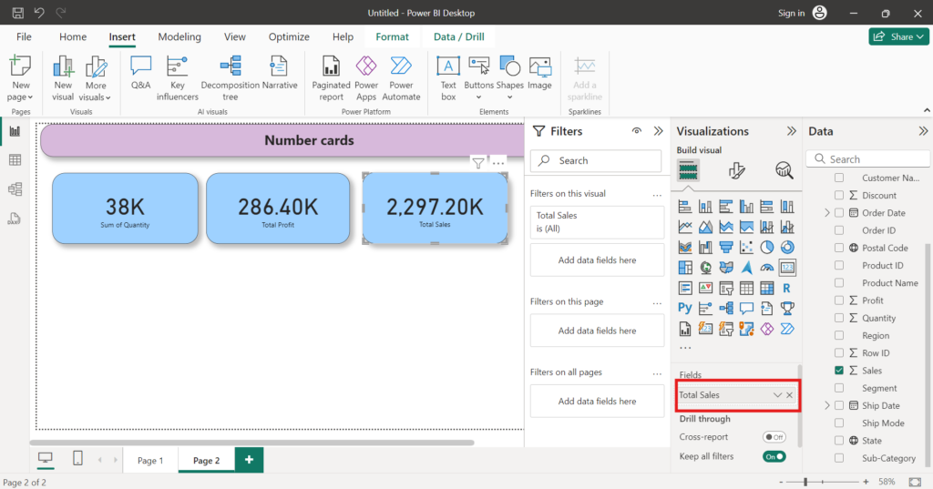
- We can create as many cards as we want by repeat the above steps with different measures or fields.
Use Multi-Row Card in Power BI
To use Multi-row card follow these steps:
- Import data from data-source in the Power Bi Desktop.
- From the visualizations pane, click on the “Multi-row card” icon to add a multi row card to the report canvas.
- From the Data Section (Fields Pane) on the right-hand side, select the fields we want to display in the multi row card.
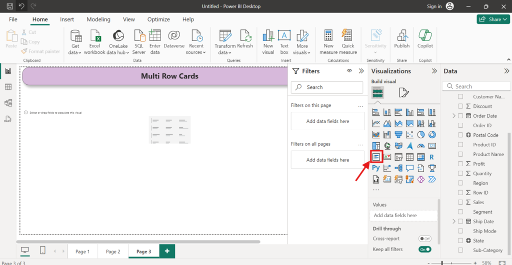
- Drag and drop these selected fields on the multi row card.
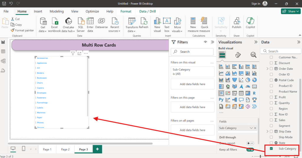
- We can adjust the formatting, font size, colors, and other visual settings using the formatting options in the Visualizations pane.
- We can also add additional fields to the multi row card by dragging and dropping them from the Data section.
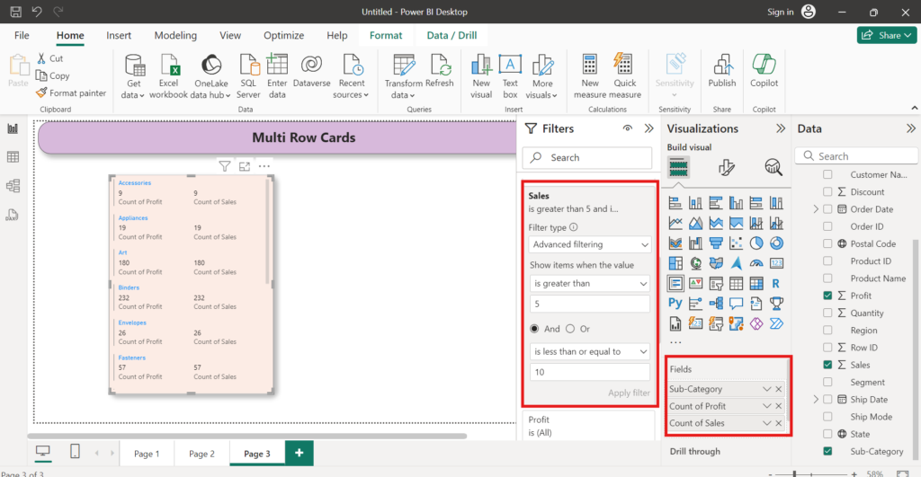
- We can resize and rearrange the multi row card on the report canvas as needed.
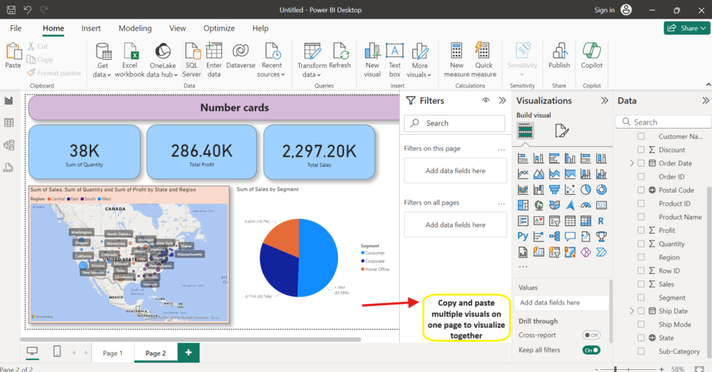
Similarly, we can create other visuals available in Power BI desktop and can get valuable insights from our data.
Choose the right visual for our report
There are multiple visuals that we can choose to represent our data through visualization.
To represent data in specific visuals of our choice, we need to capture or calculate the specific information.Here, The choice of right visual will largely depend on the nature of the data we are communicating and the message we want to convey with that data representation.
As per nature of data in Power BI, visuals are divided into six main categories.
- Comparison
- Data Over Time
- Correlation
- Distribution
- Part-to-whole
- Ranking
Single visual format can be used as part of multiple categories. Like Bar Chart is used for Comparison, Data Over Time, Correlation.
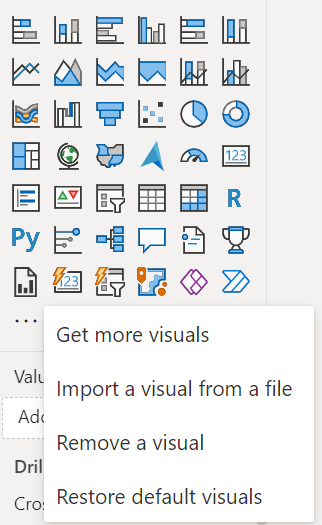
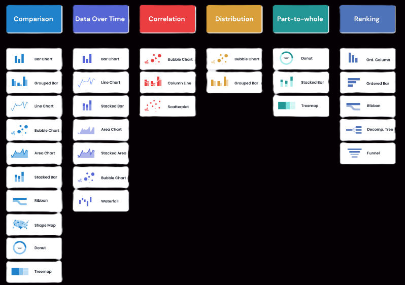
- Comparison visuals are used to compare data between two or more different datasets, columns or categories. Visuals like Bar Chart, Grouped Bar, Line Chart, Bubble Chart, Area Chart, Stocked Bar, Ribbon, Shape Map, Donut and Tree-map are used for comparison.
- Data Over Time – These visuals show us how information evolves across different periods. This allows us to identify trends or shifts and can be helpful in making projections. Visuals like Bar Chart, Line Chart, Stocked Bar, Area Chart, Stocked Area, Bubble Chart and Waterfall are used for data over time.
- Correlation – These visuals are used to find the relationship between two or more variables. Visuals like Bubble line, Scatter plot, Column Line are used for correlation.
- Distribution – These visuals help us understand the underlying patterns and trends within the data by displaying the range of values and how they are spread out.
- Part-to-whole – These visuals used to show the breakdown of elements that add up to a whole.
- Ranking – These visuals present a sequential arrangement based on a specific metric, emphasizing the significance of an element’s position over its comparative value.
Summary
In this article, we learned about Dashboard visuals- How to use visuals in Power BI. Following topics were covered:
- Dashboard visuals in Power BI
- How to use visuals in Power BI
- Import data into Power BI Desktop
- Text Bar – Use Text Bar in Power BI
- Bar Chart – Use Bar Chart in Power BI
- Use Horizontal Bar Chart in Power BI
- Use Pie Chart in Power BI
- Use Donut Chart in Power BI
- Use Map in Power BI
- Use Card Visual in Power BI
- Use Multi-Row Card in Power BI
- Choose the right visual for our report
- Learn more about Power BI Visuals
Posts for category – PowerBI

Hello! I hope you’re having a great day. Good luck 🙂
I’m really impressed with your writing abilities as neatly as with the format on your weblog. Is that this a paid subject or did you modify it your self? Either way stay up the nice high quality writing, it is rare to see a great weblog like this one nowadays!
hi