
Power BI as most popular visualization tool, it is not limited with basic and advance visual graphs or charts but also it has some key features like slicers, filters, bookmarks, and selections etc. which improve user experience and facilitate better insights.
1. How to create Slicers in Power BI
Before we are going to understand how to create slicers in Power BI, we need to understand the requirement of it.
Importance of Slicer – Making slicers is one of the really basic capabilities, letting users filter data interactively on their reports or dashboards. Where viewers could simply see the data slices really helps them give specific attention to parts of the data, making the experience much more effective for data exploration overall.
Creating Slicers in Power BI
To create the slicer we need to follow these steps:
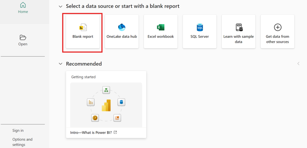
Step 1: Open Power BI Desktop
Open Power BI desktop and click its icon to open the Power BI application to open the report where you want to add a slicer.
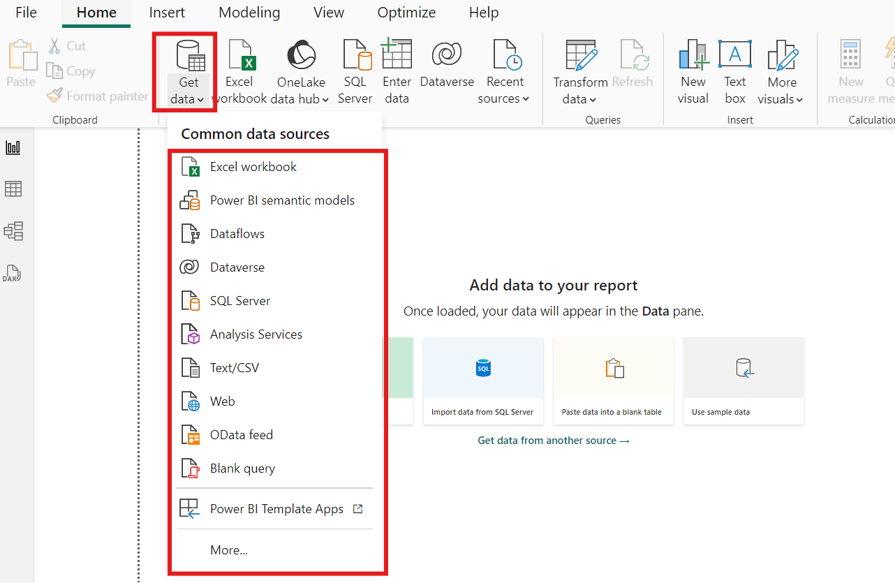
Step 2: Load the Data
To load the data, go to ribbon and click the Get data button. There are many options to load the data in power BI desktop.
You can achieve this by importing data from a file like Excel or CSV or by connecting to the data source like SQL Server or online service.
Step 3: Add a Slicer
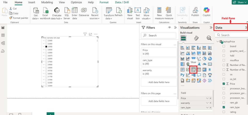
Look at the right-hand side of the page for the “Visualizations” pane, and locate the “Slicer” visual – it is represented by a small filter icon. Click it to put a slicer on your report canvas.
Select the Field for the Slicer: Look to the “Fields” pane on your right hand side and find the field that you’d like to use for the slicer. It could be any categorical field, “Product Category,” “Region,” or “Date.”
Drag and drop your selected field into the slicer visual that you’ve just added to your canvas. Or alternatively, select the slicer and then pick the field that you want to apply it to.
Step 4: Configure and customize the Slicer
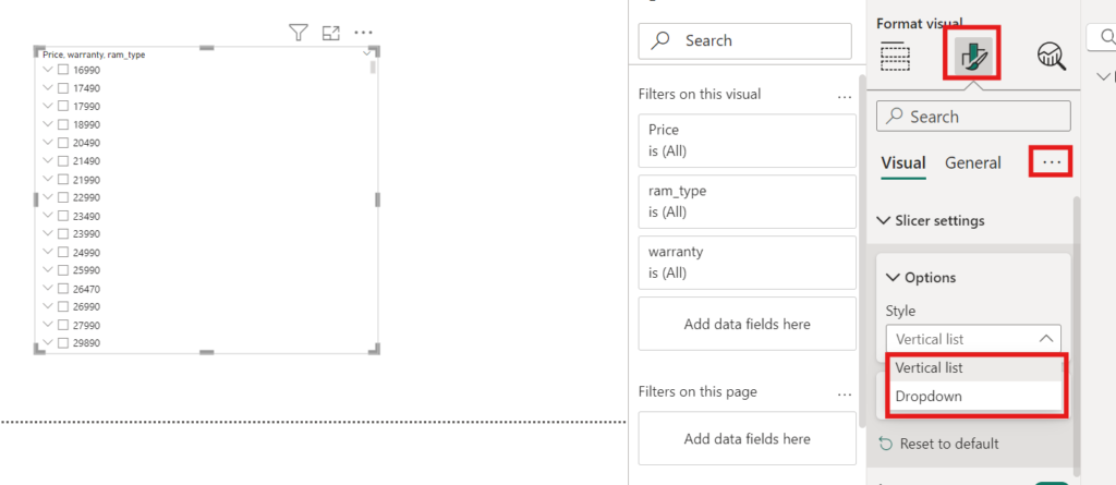
The slicer by default rendered as a dropdown list if it is a categorical field, otherwise as a list of checkboxes.
The slicer settings can be configured.
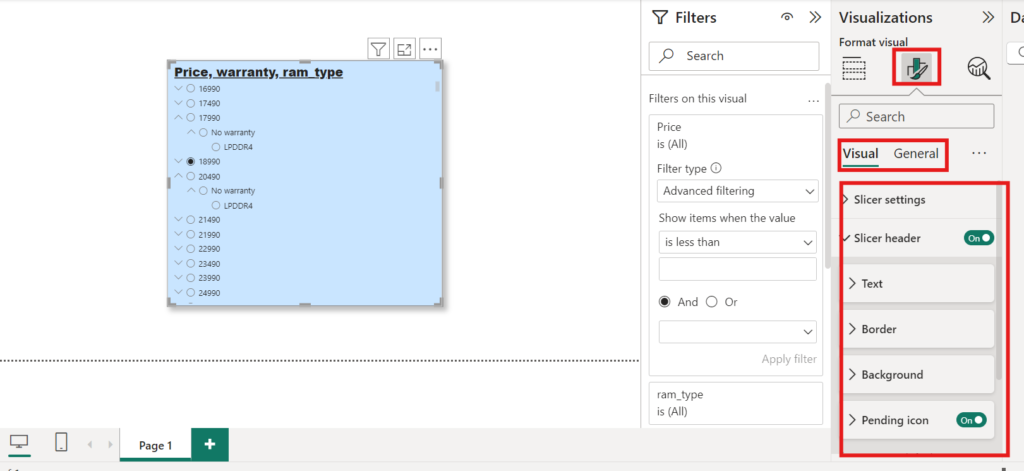
Slicer Type: You can make a slicer a dropdown or a range slider (vertical list), mainly when you’re working with numerical or date fields, by navigating to the “Visualizations” pane, clicking the ellipsis (three dots), and selecting the type.
Now, click the “Visualizations” panes and look for the “Format” (paint roller) icon.
Here, you can adjust several settings:
Orientation: Horizontal or vertical and can be achieved by making an appropriate layout selection from the visualization’s formatting pane.
Title selection: Title Enable or disable the title, and input your custom title.
Background: Change the background colour of the slicer.
Font size and colour: Change the font size and colour to make it visible.
Border: Put in or change the border of your slicer.
After creating and customizing your slicers, save your Power BI report to retain your changes.
2. How to apply filters on visuals in Power BI
Data Filters: These functions help in refining or sifting the data that you want to depict in your reports. Most importantly filters are divided into three level in Power BI:
Visual Level Filters: These filters are applied to an individual visualization. Example: In a chart, show sales only of a specific year.
Page Level Filters: When weset on all of the visuals on a given page of our report. These filters help to make sure all the visuals on the page are focused on certain segments of your data.
Report Level Filters: These are set for an entire report, while they remain the same for each page and visual.
Apply filters on visuals
To apply the filters there are some steps which we need to follow:
- Open the power BI desktop, upload the data, create the visual and select it for apply filters on it.
For example, here we have select the bar chart to apply filter on it.
2. As we have already discussed there are three type of filters: Visual level, Page level and Report level. Here we have selected only one visual to apply filters(from ‘Filters’ Pane) on it so this type of filters are called visual level filters as depicted in the image below.
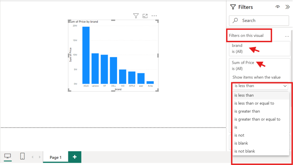
3. Add Fields to filter: To apply filters on the visual, Drag a field from the “Fields” pane to the “Visual level filters” area. Or click on the dropdown next to the field and specify filter conditions:.
4. Configure Filter Details: Alter the filter types, being either individual selections, ranges, or top N, less than, greater than and more are depending on what we would like to filter.
Example: Applying filters on cards (A visual) in Power BI,
follow these steps:
- Click on the card or cards you want to apply the filter to in your report.
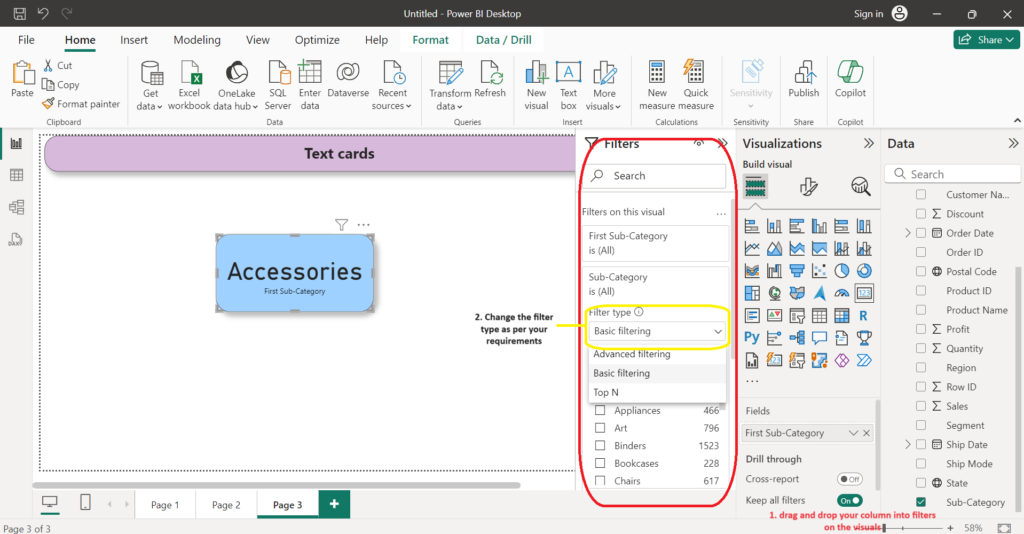
2. In the filter pane on the right side of the screen, select the field we want to filter by. We can choose from any of the fields in your dataset.
3. Choose the specific value or values we want to filter by. You can select multiple values if needed.
4. Click “Apply filter” to apply the filter to the card or cards.
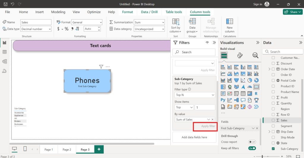
5. The card or cards will now display only the data that meets the filter criteria.
6. You can remove the filter at any time by clicking on the “X” next to the filter in the filter pane.
3. How to apply Bookmarks on visuals in Power BI
Bookmark is a very useful key feature or powerful tool of Power BI which use to enhance data storytelling, improve user experience, and also streamline the complex reporting tasks. With that, it is easier for stakeholders to understand insights from data. It allows you to save the current state of a report page-filters that are applied, visuals that are shown, and the order in which your visuals are sorted-and use them for storytelling, presenting your reports, and navigation within your report.
Follow these step to understand, how to apply and use bookmarks in Power BI:
- Open Your Report & Arrange the Visuals: When you want to set the bookmarks on your report. Open your report in Power BI Desktop and set up the report page as per your requirements for bookmarks. This may include any filters applied, visuals displayed or hidden, and their layout.
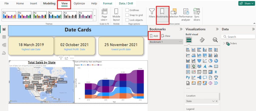
2. Create a Bookmarks: After report selection and setup go to the “View” tab on the ribbon. Then click on the “Bookmarks Pane”. This will open the bookmarks pane on the right side of your Power BI desktop. Now click on the ‘Add’ button to create a Bookmark.
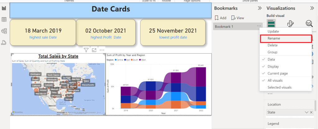
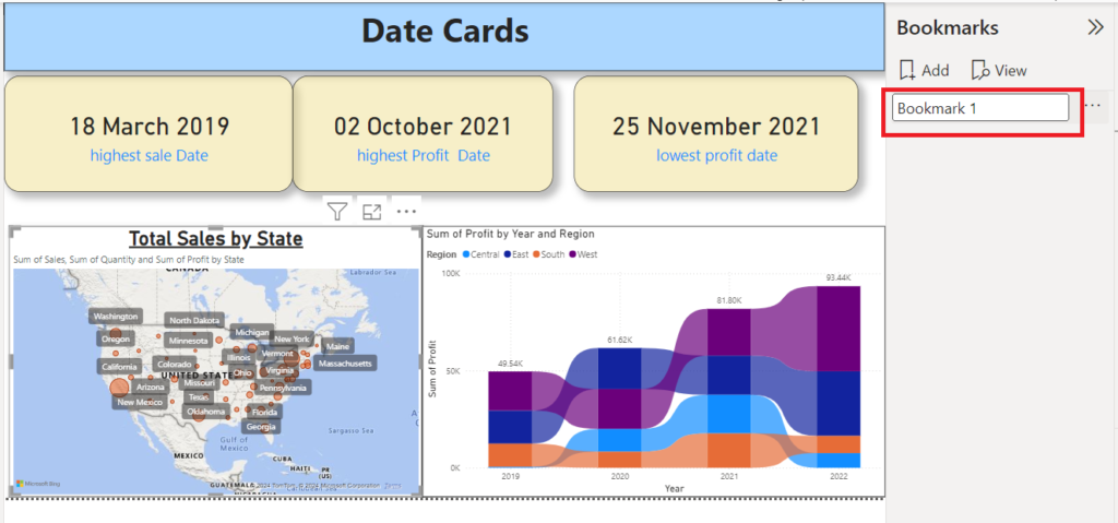
3. Rename the bookmark: When you create a new bookmark. By default, the bookmark is given the name “Bookmark 1”. Now right-click on the bookmark and click on “Rename” to give it a meaningful name that would reflect what it captures, say “Sales Overview” or “Q1 Analysis”.
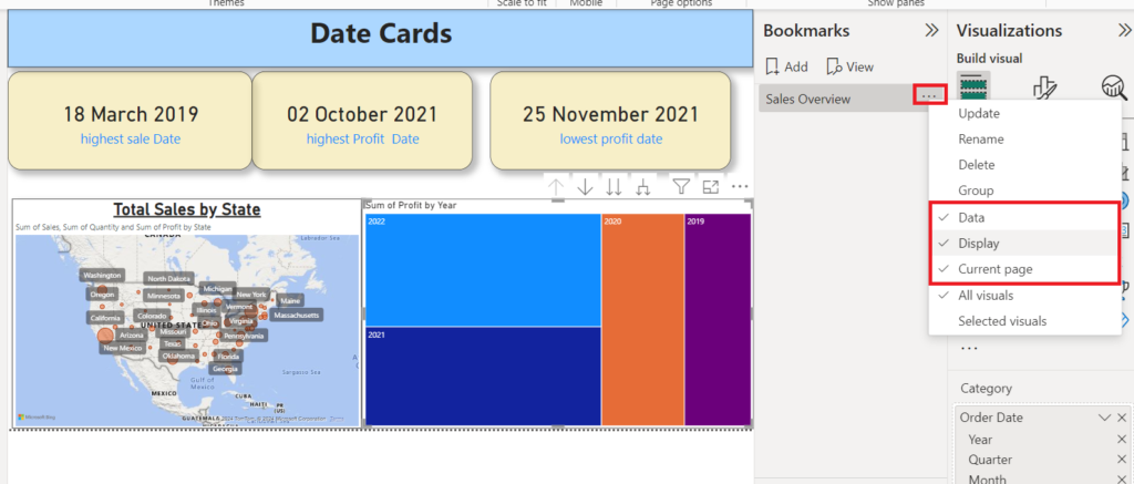
4. Set Bookmark options: After rename the bookmark, now right-click on bookmark and select “Bookmark settings.” In the next options you’ll see what your bookmark should contain:
Data: Attributes include filters and slicers.
Display: Properties, including Spotlight and its visibility.
Current page: Changes, showing the page that was visible when the bookmark was created.
Choose depending on the type of functionality you would want the bookmark to possess.
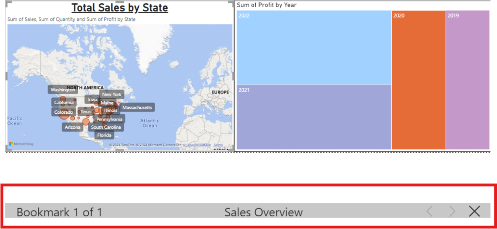
5. Bookmarks as a slide show: When you have a collection of bookmarks you’d like to present in order, you can view them as a slide show in Power BI Desktop, and in the Power BI service in either Edit or Reading mode.
In the Bookmarks pane, select View and see the slide show in Power BI Desktop.
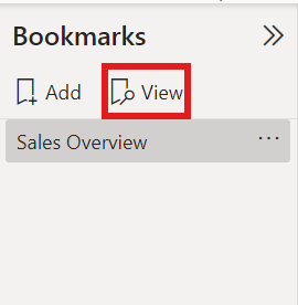
After creation of Bookmarks click on the the to check they are working as per the requirement.
4. Using the selection pane for advanced control power bi
In Selection Pane, as its name say selection it means it use to control the selection process of visuals over different visual elements and objects in your report pages for their visibility and interaction. This selection enables you, being a Report author, to efficiently manage your visuals and layers in creating dynamic user-friendly reports. Have a close look at how to use Selection Pane in Power BI:
- Open Power BI desktop and select the selection pane: First open your report page on your Power I desktop than click on view button present on ribbon and click on the selection button in the show pane at the right side of the screen.
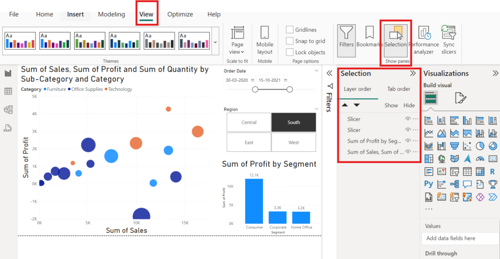
When you click on the selection button, you can see the list of visuals is open. This may includes charts, tables, images, shapes, and text boxes etc. With the help of selection pane you can:
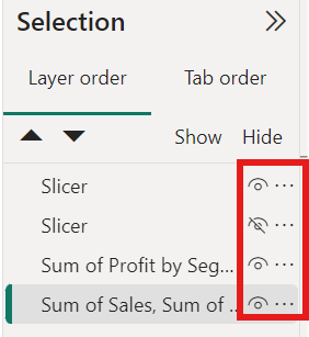
- Control the visuality of visuals: In selection pane, with every visual, you’ll see an eye icon. Clicking on that icon will toggle the selected graphic on or off. Useful to keep track of how many items are shown during any presentation, and while building the report.
2. Renaming of Visual: Every visual has their default name, such as chart, slicer, map etc. But, you can double-click on a name to rename it so you can more easily identify it. This is helpful for specify the visual when you have to navigate many elements in reports.
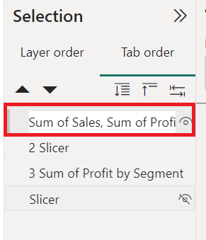
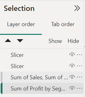
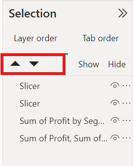
3. Visuals in order: You can use the selection pane in Power BI for more control in this action. Not only does it give you a view of the order, but it also allows you to simply drag the order of the visuals.
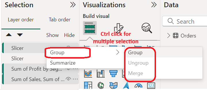
4. To Group or ungroup visuals: With Selection pane, you can Group many visuals together so that you can collectively manage their visibility and positioning.
To group visuals, select the visuals by holding down the Ctrl key and clicking on them.
Right-click and click on “Group”.
5. layering: The selection pane also use to features the management window for visual layering. Suppose you have few images or text boxes overlapping each other and you would like to bring some visuals forward and the others to the back for easy reading.
To change the order, you can either drag and drop a visual to another place in the list or just select a visual and use arrow buttons to move it up or down.
By using these features of visibility control, grouping, and layering lets you build more interactive reports and make them more interesting.